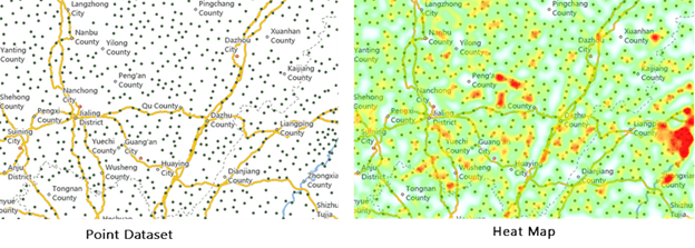
The heat map uses colors to depict phenomena such as population distribution, density, and the trend of change. It is a very intuitive way to present data, such as density, frequency, temperature, etc.
A heat map can create a buffer zone for each discrete point, then use a gray gradient color to fill each buffer zone. Since colors can overlay with each other, and the more overlays, the brighter color, the heat map will present a hot phenomenon in the area that has a lot of zone intersections. In general, low-density and high-density points are drawn from cool color to warm color. You need to turn on the alpha channel of the map for the heat map.
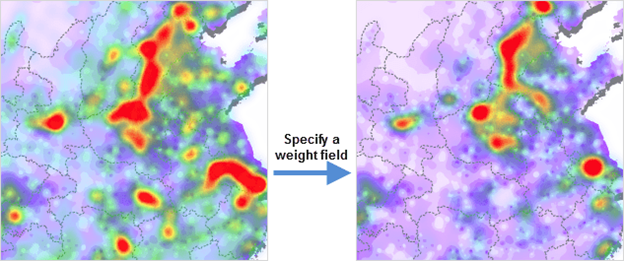
In addition to reflecting the relative density of points, the heat map layer can also represent the point density weighted according to attributes.
The heat map changes over zooming in or out of the map. It is a dynamic raster surface. For example, when zooming in on a map, the heat map layer for visitors of national tourist attractions will reflect the distribution of visitors to tourist sites in a province or a local area.
The heat distribution density can be determined according to the overlay of discrete point buffers, and the weight is to determine the influence of the point on the density. The weight of a point determines the impact of the buffer of the point on the density. If the original impact coefficient of the point buffer is 1, the weight of the point is 10, then the influence coefficient of the point buffer is 1*10=10 after introducing the weight.
Then, after the weight is introduced, a new gray value after overlay will be used for indexing. The specified color ramp will be used for rendering to get the heat map. You can specify a numerical field as weight.
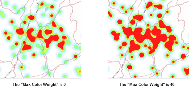
When you select a color ramp, colors will then be assigned automatically. Set the maximum and minimum color values respectively and build a color ramp with the maximum and minimum color values. The color with the maximum value will be used to render the heat map with the maximum gray value (the hottest area), while the color with the minimum value will be used to render the heat map with the minimum gray value (the coldest area). Along with these, you can adjust the transparency of the color. You can change the transparency with the slider, or directly enter a number from 0-100. The default is 0, fully opaque. The heat map with a translucent effect is easy to overlay with the base map. After that, adjust the blur degree of the color gradient in the heat map, therefore adjusting the rendering effect of the color ramp. Also, determine the proportion of the maximum color value in the gradient ramp. The larger the value, the greater weight the maximum color takes up in the color ramp.
Sample Map: The heat map based on traffic data of map sampling points describes the traffic intensity trend.